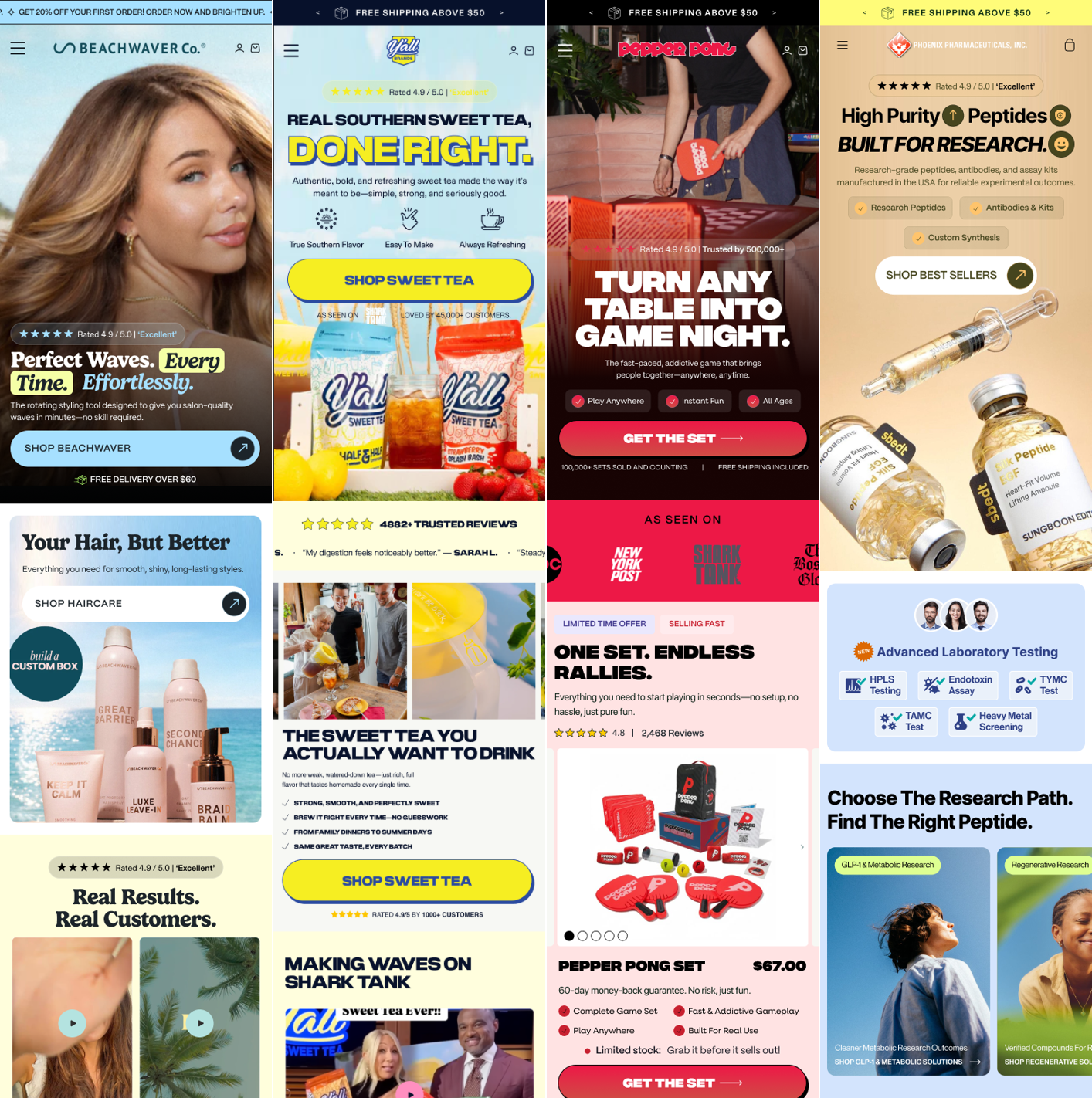
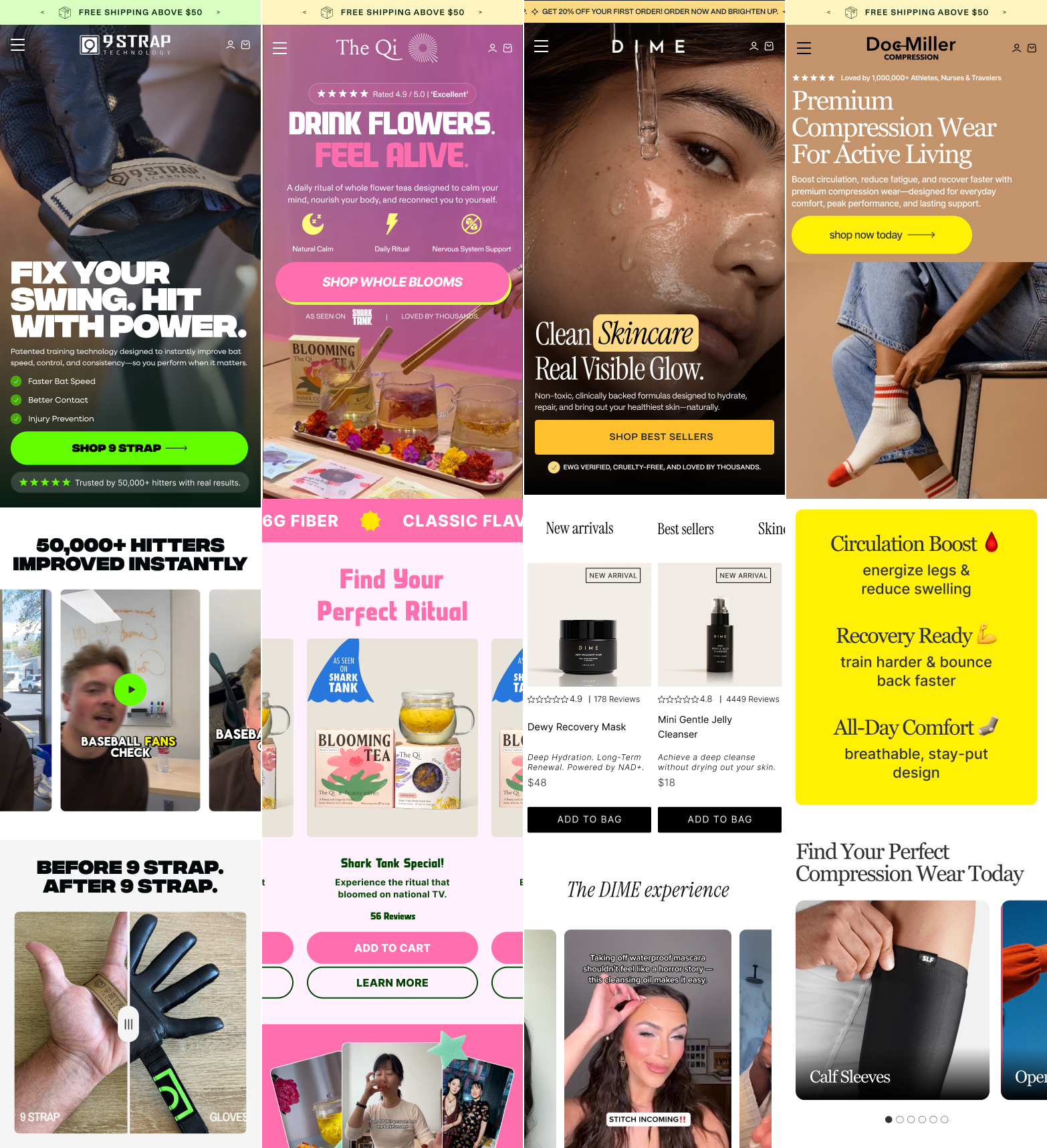
We tore down hundreds of 7 and 8 figure stores. These 16 sections showed up every time.
By Kam HossienyFounder, Solvexmedia. CRO for 7 and 8 figure brands
Section 01
The Hero
The only section 100% of visitors see. If it fails, nothing below it matters. One job: make the visitor stay and want the product.
1
The 5-second test
Design for scanning
Visitors decide in 5 seconds whether the page is relevant. Design for instant comprehension, not complete reading.
Must answer instantly
What is this?
Is this for me?
What will it do for me?
How to run the test
Show hero to a stranger for 5 seconds
Cover the screen
Ask: what does this product do?
If they can't answer, simplify
Quick fixes
Headline under 15 words
One product image
One trust signal
One CTA button
2
Eyes follow patterns, design for them
Layout law
Put the most important elements where eyes naturally go.
Desktop. F-pattern (left dominates)
img
Left: Headline → subheadline → trust → CTA
Right: Product image
Cover the right half, can you understand the full offer from the left side alone?
Mobile. Z-pattern (top to bottom)
img
Top: Headline
Middle: Product image
Bottom: CTA button
Does it flow headline → image → CTA without hunting?
3
CTA in the thumb zone
Mobile rule
Most visitors hold phones one-handed. CTA must sit in the bottom third, full-width, minimum 50px height. Highest-contrast element on the page, never grey.
Min height: 50px · full-width on mobile
Position: bottom third of the hero
Highest-contrast element, never grey or white
Copy: "Start tonight" not "Shop now"
product image
Start tonight →
↑ CTA in thumb zone bottom third · full width
Real brand examples
Example 1Grüns. Superfoods Greens GummiesWhat they got right
✓ Social proof above headline
★★★★★ 4.8 · 85,000 reviews · 1M+ members, trust before a single word is read.
✓ Problem-led headline
"You have nutrition gaps, Grüns fills them", problem + solution in one line.
✓ Offer in the CTA
The offer IS the CTA copy. Urgency badge on product image reinforces it.
Example 2Hero BreakdownWhat they got right
Section 03
Social Proof
The 4 types of proof, when to use each
1
Authority proof
Doctor endorsement, press logos, certifications, awards
Above fold · near headline
2
Peer proof
Customer count. "80,000+ happy customers"
Hero section · trust bar
3
Results proof
Before/afters, specific outcomes, clinical data with numbers
Mid-page · below mechanism
4
UGC proof
Real customer photos, unboxing, selfies with product in real settings
Carousel · review section
Place proof where doubt lives
"Does this actually work?"
→
Before/after photos, specific measurable results with real names
"Will it work for me?"
→
Reviews from people with same age, skin type, or problem
"Is it worth the price?"
→
Value testimonials. "worth every penny because…" with specifics
"Should I really buy this?"
→
Guarantee + most recent positive review directly above CTA
Specific beats vague every time. "Lost 14lbs in 6 weeks. Sarah, 38, Ohio" converts harder than "Great product, love it!" Pull reviews with real numbers, real names, real outcomes.
Real brand examples. 4 proof types in action
UGC ProofSACHEU Beauty. Video UGC wallCustomer video proof
✓ Real customers, real environments
Bedroom lighting, no script, imperfection signals authenticity that studio videos can't fake.
✓ Volume signals credibility
5+ videos in one view. Volume signals credibility, everyone is buying this.
✓ Diverse personas
Different faces, skin tones, ages, every visitor finds someone who looks like them.
Text ReviewsProtein brand. "What People Think"Written review section
✓ Review title as the hook
The largest text on each card is the title. "Sooooo Good!", scannable before reading body copy. Most visitors never read the body.
✓ Aggregate rating above cards
★★★★★ with review count displayed before individual reviews. Volume + rating in one glance builds trust before a word is read.
✓ High-contrast brand colour
Orange background makes the section unmissable. The review section has the same visual weight as the hero, not an afterthought.
PR / Press ProofNeuro. Press logos with pull quotesAuthority through media
✓ Logo + quote format
Logo + specific quote per publication. The quote sells; the logo validates it.
✓ Shark Tank as social proof
"I have no doubt they'll be a hit!", celebrity endorsement framed as press coverage.
"Most Popular" or "Best Value" badge on target option
5–7 benefit bullets, one line each, no paragraphs
Guarantee badge directly below the CTA
The offer stack, never just discount
What not to do ✕
✕10% off coupon, trains customers to wait
✕Single price point with no anchoring
✕Vague bundle with no saving shown
✕Discounting before value is established
What works ✓
✓Volume pricing with exact savings clearly shown
✓Free shipping threshold, #1 AOV lever
✓Digital add-on, near-zero cost, high value
✓Subscribe & save, monthly saving shown upfront
Badge the middle. Buy 1 ($29) · Buy 2. Most Popular ($26 each) · Buy 3. Best Value ($24 each). Even buyers who choose Buy 1 spend more because the anchor makes it feel like the deal.
Real brand examples
Example 1Javvy + Mars Men. Buy box with volume pricing + gift stackValue stacking in action
✓ Volume pricing anchors the decision
4-tier pricing anchors with lowest per-unit at top. Crossed-out original ($183→$92) makes the saving undeniable.
✓ Free gift stack removes the "too expensive" objection
FREE $14, $28, $42 gifts stacked below the buy box, the $92 price feels like a bargain before a benefit is read.
✓ "50% OFF FOR LIFE" creates urgency without a countdown
"50% OFF FOR LIFE", framed as a permanent benefit, not a one-time promo.
Example 2Javvy Protein Coffee. Offer stack with seasonal bonus giftsGift ladder + bundle offer
✓ "BEST DEAL" + "MOST POPULAR" badges on 4-bag grid
BEST DEAL on the top tier, MOST POPULAR on the middle, visitors are guided to a decision without choosing blindly.
✓ "SPRING SPECIAL" gift row creates time pressure
5 gifts in a row below the selector. The offer feels like an event, urgent and exclusive.
✓ Crossed-out price is the highest number on the page
$213.75 → $85.90. Crossed-out price is the biggest number on the page. No code needed.
Example 3PetLab Co.. Subscribe & save with tiered package selectionSubscription-first buy box
✓ Subscribe & Save tab pre-selected by default
Subscribe & Save is the default tab. Visitor must actively choose one-time, subscription is the path of least resistance.
✓ Doctor quote in the buy box
Doctor quote inside the buy box, authority proof at the exact moment of decision.
✓ Cost-per-unit pricing builds value
"$0.94 per chew", per-unit cost anchoring makes the price feel trivial.
Section 06
The Benefit Section
People don't care what it has. They care what it does for them.
Feature copy ✕
✕"Contains magnesium glycinate"
✕"Triple-filtered extraction method"
✕"20g of protein per serving"
✕"60 superfoods per pack"
Outcome copy ✓
✓"Asleep in 20 minutes"
✓"Absorbs 3x faster, you feel it working"
✓"Stay full for 4+ hours"
✓"No more 2pm energy crash"
Format: [Outcome], [brief why]. Use numbers ("3x faster", "in 30 days", "40% reduction"). 6–8 max. Icons or checkmarks only, no paragraphs.
Examples
Example 1Benefit-focused copy in actionOutcome copy
✓ Outcome-led headline
Copy leads with the transformation, not the feature, immediately resonates with the customer's desire.
✓ Benefit stacking
Multiple benefits shown in scannable format, visitor understands the full value at a glance.
✓ Emotional hook
Speaks to the feeling the customer wants, not just the product specs.
Example 2Benefit-focused copy in actionOutcome copy
✓ Outcome-led headline
Copy leads with the transformation, not the feature, immediately resonates with the customer's desire.
✓ Benefit stacking
Multiple benefits shown in scannable format, visitor understands the full value at a glance.
✓ Emotional hook
Speaks to the feeling the customer wants, not just the product specs.
Example 3Benefit-focused copy in actionOutcome copy
✓ Outcome-led headline
Copy leads with the transformation, not the feature, immediately resonates with the customer's desire.
✓ Benefit stacking
Multiple benefits shown in scannable format, visitor understands the full value at a glance.
✓ Emotional hook
Speaks to the feeling the customer wants, not just the product specs.
Section 07
The Mechanism Section
People need to understand how it works before they'll believe it works.
How it works rules
3–5 steps max, icons or arrows
Plain language. 5th-grade reading level
Each step = one action or visible outcome
Ingredient format
[Ingredient] → what it does → why this version
Explain why it matters, don't just list what's in it
Ingredient breakdown, the right way
Magnesium Glycinate
Crosses the blood-brain barrier, not oxide, which doesn't
Why this version: absorbed 3x more efficiently, you actually feel it
L-Theanine
Calms the nervous system without sedation
Why this dose: 200mg, the clinical threshold for effect
What to expect timeline
Week 1
Sleep latency improves. Easier to fall asleep.
Week 3
Waking less in the night. More rested mornings.
Month 2
Deep sleep increases. Energy during the day.
Month 3
Full reset. Consistent, restorative sleep.
Why timelines work: removes "how long until it works?" · sets realistic expectations · reduces refunds · builds trust through honesty.
Real brand examples, mechanism formats
Example 1Nutritionals comparison table with real-world equivalentsIngredient breakdown that converts
✓ Numbers translated into familiar things
"17g protein = more than 2.5 large eggs", abstract numbers made instantly understandable.
✓ High / Low direction arrows
↑ High / ↓ Low arrows tell the visitor if each number is good, no nutrition knowledge needed.
✓ Emoji as visual anchor
Emoji per row (🥚🥥🍌) communicates the comparison before reading. Faster comprehension = higher trust.
Example 3Tarla. "How it works" 4-step with illustrated iconsIcon-based mechanism strip
✓ Brand personality in the icons
Custom illustrated icons + tone-matched names ("Ding Dong", "Take the Credit") make the mechanism memorable.
✓ Step names are outcomes, not instructions
"Take the Credit", steps framed as rewards, not instructions. The buyer feels accomplished.
✓ CTA at the bottom of the mechanism
CTA directly after the last step, buy opportunity appears when comprehension peaks.
Example 4Fussy. "How it works: Refill, Reuse, Repeat" 3-step with product photographyPhoto-led mechanism strip
✓ Real hands using the product
Hands using the product in each step, more immediate and personal than a product shot alone.
✓ Tagline frames the mechanism
"Refill, Reuse, Repeat" above the steps frames the system before explaining it.
✓ 3 columns = visual equality
3 equal columns, no step looks harder than another. Simple display = simple product.
Section 08
The Comparison Table
Make every alternative look like an obvious downgrade.
Rules
Lead with points you win most convincingly
Never name competitors. "traditional options"
End with your strongest USP
Why it works
Differences obvious at a glance
Answers "why is this more expensive?" pre-emptively
You look better next to alternatives
ExampleGrüns. "Us vs. Them" comparison tableHigh-converting format
✓ Your column highlighted
Grüns column in brand green, visually dominates. The competitor columns recede to grey. No text needed to tell visitors who wins.
✓ Cost per serving anchors value
$1.47 vs $3.60, the first row is price comparison. Wins on value before a single feature is compared.
✓ "Not overhyped or overpriced" headline
Copy next to the table frames the brand as the honest, accessible choice before the visitor reads a single row.
Section 09
The FAQ
Every FAQ question is an objection in disguise. Place directly above the final CTA, answer the last doubt at the last moment.
The question
What it really means
How to frame the answer
"Is this safe for beginners?"
"I don't know if this is for me"
"Yes. 60% of customers had never tried this before"
"How long until I see results?"
"I'm scared it won't work"
Name a specific timeline, future-pace the outcome
"What if it doesn't work for me?"
"I'm afraid to waste money"
Lead directly into the guarantee, remove all risk
"Is this worth the price?"
"It feels expensive"
Reframe as cost-per-day. "$1.60/day to never have back pain"
"What makes this different?"
"I've tried things like this before"
Reintroduce your unique mechanism one final time
Use customer language. "Will this work for me?" not "Product suitability"
5–8 max, answer like you're talking to a skeptic
Most important answer open by default
Want us to audit these 16 elements on your store?
We optimize stores from $1M to $50M+ per year. Get the exact fixes we use to 2 to 4x conversion rates.
The most underbuilt revenue asset in DTC. The visitor who adds to cart is the warmest lead on your entire page.
8 non-negotiables
High-contrast checkout button, visible without scrolling
Outcome CTA copy. "Secure my order"
Free shipping threshold progress bar
Savings shown. "You're saving $24.00"
Delivery estimate, specific date, not a range
Security + payment trust signals above CTA
Guarantee reminder below CTA, one line
Sticky mobile bar, always visible
Upsell types that work
Complementary product, one-click add
Bundle upgrade, show saving clearly
Subscribe & save, highest LTV lever in cart
Sample add-on, low commitment, high perceived value
Gift add-on, seasonal, high margin
Never discount to recover a cart. Fix delivery surprise, add guest checkout, show the guarantee. Discounting trains customers to abandon deliberately.
Real brand examples
Example 1Mate Endurance. Milestone progress bar + complementary upsellsUnlock-based cart
✓ 3-milestone progress bar
Free Shipping → 5% Discount → Free Gift. Each unlock is celebrated visually. The visitor is rewarded for adding more, not asked.
✓ Review inside the cart
"mate's supplements have me feeling like a more confident version of myself", one specific testimonial placed directly above the upsell row. Social proof at the highest-intent moment.
✓ Complementary upsells by outcome
Erectile Dysfunction · Libido · Sperm Health, each upsell is a different problem the same buyer has. Relevance makes adding feel smart, not upsold.
Example 2Grüns. Subscribe upgrade CTA + family upsell inside cartSubscription conversion in cart
✓ "Subscribe & Save an Extra 25%" upgrade block
The cart itself becomes a subscription conversion point. "Most Popular" badge, three benefits, one CTA. The upgrade is offered, not forced.
✓ Savings shown in the subtotal
"32% Off · $79.99 → $54.40", the discount is the first thing in the subtotal row. The buyer sees what they're saving before the checkout price.
✓ Family upsell with social proof angle
"Kids are 90% more likely to stick with Grüns when you do too", the upsell is framed as a parenting benefit, not a product push.
Example 3Mars Men. Free gifts visible in cart + discount shown in totalsGift stack + savings transparency
✓ Free gifts as line items in the cart
Apple Watch Ultra chance + Ladder Workout App shown as "Free" items, the cart looks full of value. The buyer feels they're getting more than they paid for.
✓ Discount line in the totals
Subtotal $185 · Discounts -$93 · Total $92, the saving is a separate line, not hidden in the final price. The -$93 makes the deal feel undeniable.
✓ Trust microcopy under checkout button
"Free Shipping · 90 Day Higher T Guarantee", two trust signals, one line, immediately below the checkout CTA. Risk removed at the exact point of action.
Section 11
The Mobile Experience
70%+ of traffic is on mobile. A page that breaks on mobile is losing the majority of revenue.
✕Checkout button requires scrolling, visitors who can't see it don't convert
✓Sticky bottom bar, item count + total + checkout always visible
✕Tap targets under 44px, buttons too small to hit accurately
✓Minimum 44px on every interactive element
✕Text that requires pinching, paragraphs over 3 lines
✓16px minimum body text · 6-word max hero headline
✕Upsells that block the checkout button
✓Compact one-row upsell cards, thumbnail + line + add
✕Cart drawer with no exit, traps the visitor
✓"Continue shopping" link at the top of the cart
✕Carousels nobody swipes, horizontal scroll on mobile
✓2×2 product grids, more visibility, more clicks
✕Hero image cropped wrong, product cut off on mobile
✓Test on device, product must be fully visible on mobile screen
Section 12
Optimized Menu Navigation
Your nav is a sales tool, not a wayfinding system. High-converting stores use it to move visitors toward purchase faster.
What most brands do ✕
Full product catalog in the nav, creates choice paralysis
Generic labels. "Shop," "Products," "Collections"
No visual elements, text-only dropdown lists
Best sellers buried, visitor has to hunt
No offer or urgency in the nav at all
What high-converting stores do ✓
3–5 top-level items max, clear, scannable
Outcome or persona labels. "For Women · For Men · Best Sellers"
Mega menu with product images, reduces steps to purchase
Best sellers surfaced in the first dropdown
Announcement bar above nav for offer + urgency
Mega menu, product images in nav dropdown
BrandName
Sleep
Energy ▾
Recovery
Sale
Best sellers
Daily Greens
$49 · ★★★★★
Focus Stack
$59 · ★★★★★
By goal
→ Morning energy
→ Afternoon focus
→ Pre-workout
Bundles
→ Starter kit
→ 90-day stack
→ His & hers
⚡ Limited offer
Save 30% on the Energy Bundle
Shop now →
ExampleOptimized mega menuReal example
Announcement bar above the nav, first thing every visitor sees. Use it for offers, not generic perks.
3–5 top-level items max, every extra item dilutes click-through on all of them
Product images in dropdowns, reduces steps from intent to product page
Offer panel in mega menu, converts browsers who hover without intent
Sticky nav on scroll, keeps the cart icon and CTA accessible at all times
Section 13
The Photo Carousel
67% of shoppers look at images before reading a word. Every frame needs a job.
The 8-frame framework
Frame 1Hero shot
Product in use + strongest benefit overlay. High contrast, brand logo in corner.
Frame 2Problem visualisation
Show the pain your product solves, not the product. Specific problem = harder resonance.
Frame 3Mechanism reveal
How it works in 3 steps. Icons + short labels only.
Frame 4Comparison chart
You vs. alternatives, without naming them. Lead with your strongest wins.
Frame 5Results proof
Before/after with real numbers. Include name + location. Not "see results."
Frame 6Social proof collage
UGC + star rating + review count. Show diverse buyer personas.
Frame 7Feature → value pivot
Top 3–4 features translated into life outcomes. Lead with emotional benefit.
Frame 8Guarantee + CTA
Guarantee as headline, bold, specific. Add urgency. One clear CTA.
The golden rule: every image must be readable in under 2 seconds on a phone screen. If you have to zoom to read the text, you've lost. Design mobile-first. Bold headlines, high contrast, minimal copy per slide.
Examples
Example 1Photo carousel sequence in action8-frame framework
Example 2Photo carousel sequence in action8-frame framework
Example 3Photo carousel sequence in action8-frame framework
Section 14
Upsell / Cross-Sell
The easiest revenue comes from buyers already committed. Post-add-to-cart is the highest-converting upsell window.
4 upsell placements, in order of conversion rate
Example 1Upsell placement in actionCross-sell strategy
✓ Right placement
Upsell appears at the highest-intent moment, after the primary purchase decision is made.
✓ Clear value add
The upsell offer clearly complements the main product, customer immediately understands the benefit.
✓ Low friction
One-click or minimal-step acceptance, reduces the effort required to say yes to the offer.
Example 2Upsell placement in actionCross-sell strategy
✓ Right placement
Upsell appears at the highest-intent moment, after the primary purchase decision is made.
✓ Clear value add
The upsell offer clearly complements the main product, customer immediately understands the benefit.
✓ Low friction
One-click or minimal-step acceptance, reduces the effort required to say yes to the offer.
Example 3Upsell placement in actionCross-sell strategy
✓ Right placement
Upsell appears at the highest-intent moment, after the primary purchase decision is made.
✓ Clear value add
The upsell offer clearly complements the main product, customer immediately understands the benefit.
✓ Low friction
One-click or minimal-step acceptance, reduces the effort required to say yes to the offer.
4 upsell placements, in order of conversion rate
1st
Post-purchase page, before confirmation
"Add this to your order before it ships, one click, no re-entering payment details." Visitor is in maximum buying state. Highest-converting placement.
2nd
In the cart, below the order summary
Complementary product or bundle upgrade. One-click add, no new page, no friction. Show the saving or added value clearly.
3rd
In the buy box. Good / Better / Best
Three options side by side. Badge the middle. Anchor with the top. Even visitors who pick the base option spend more due to anchoring.
4th
Frequently bought together, below the buy box
"People who bought X also added Y." Show combined savings. One-click add. Never show a competing product, show a complementary one.
6 upsell types that convert
Complementary product
Genuinely related, not just another bestseller. One-click add.
"Shaker bottle with your protein → +$14.95"
Bundle upgrade
Show what they have, what the bundle adds, and the saving. Frame as value.
"Upgrade to 3-pack, save 25% ($74 vs $87)"
Subscribe & save
Highest LTV lever. Show monthly saving and cancel anytime upfront.
"Subscribe and save 15%. $41.65/mo"
Sample add-on
Near-zero commitment, high perceived value. Best for supplements, beauty, food.
"Add collagen sample for $2"
Gift add-on
Low friction, high margin, emotional value. Converts around key dates.
"Gift wrap + message. $4.95"
Warranty / protection
For tech or high-ticket items. Highest-confidence moment = most open to it.
"2-year protection plan. $9.95"
One strong offer beats three competing ones. If it feels like extraction, they close the cart.
Section 15
Email Capture
Email is the highest-ROI channel in ecommerce, but only if you're capturing the right visitors with the right offer at the right moment.
Kills it ✕
"Join our newsletter", no one wants that
Fires immediately on page load
No incentive. "stay updated"
No follow-up flow
What converts ✓
Specific offer, discount, guide, early access
Exit intent or 30–60s delay
One field only, email, nothing else
Feeds a welcome flow with the offer
Email capture placements, where and when
Exit intent pop-up, highest converting
Fires when visitor moves cursor toward browser close. Last chance to capture before they leave. Best offer goes here.
Wait, get 15% off your first order
Enter your email and we'll send it instantly
your@email.com
Get 15% off →
Footer email capture, high-intent visitors
Visitors who scroll to the footer are already interested. Embed a simple one-field capture with a specific incentive, not a newsletter opt-in.
Get 10% off your first order
Plus sleep tips from our experts
your@email.com
→
Mid-page inline capture, content sections
Embedded within long-form content, after a how-it-works section or results section. Visitor is engaged. Frame the capture around getting more of what they're already reading.
Quiz / tool result gate
Run a quiz or calculator. Before showing results: "Where should we send your personalised recommendations?" Highest perceived value exchange, they want the result. Capture rate is 2–3x standard pop-up.
One field only. Email address and submit. Every extra field reduces completion rate.
Real brand examples
Example 1Gray hair brand. Exit intent with before/after proofOffer + social proof in the pop-up
✓ Before/after image in the pop-up
Before/after in the pop-up, results proof before the ask. Proof → offer → action.
✓ CTA copy reduces friction
"HOLD MY 50% OFF", first-person CTA sounds like the visitor's own thought.
✓ "I want to pay full price" dismiss link
"I want to pay full price" dismiss, the visitor has to opt out of their own saving.
Example 2Tushy. Quiz-style segmentation pop-upDiscount + segmentation in one step
✓ Discount before the email ask
"You've Got $10 Back!", the reward is granted before the email ask. They just need to claim it.
✓ Segmentation question does double duty
Segmentation question collects intent data AND personalises the experience in one step.
✓ Product photography fills the right half
Right panel shows product in lifestyle settings, they see the life they're buying.
Example 3WaterBoy. Discount + segmentation with lifestyle imageEmail + intent capture in one pop-up
✓ Lifestyle image builds desire before the ask
Lifestyle photo establishes brand identity before the email field appears.
✓ "I primarily want hydration for:" segments intent
4 intent options tell the brand which flow to trigger. Email + segmentation in one step.
✓ Exclusivity framing creates urgency
"Only way to access Black Friday deals", the list is exclusive access, not a newsletter.
Section 16
The Footer
High-intent visitors who scroll to the footer are looking for a reason to trust. Most brands waste it on legal links.
What belongs here ✓
Founder story, one paragraph, real photo, real name
Links to top product categories
Email capture with a real incentive
Trust badge row, certifications, press logos
Contact info, signals a real business exists
What most brands do wrong ✕
Only legal links. Privacy, T&Cs, Returns
No trust signals anywhere in sight
"Join our newsletter" with no reason to sign up
No human element, no face, no story, no name
Buried guarantee language nobody will find
Visitors who scroll to the footer are not leaving, they're looking for a reason to stay. Give it to them.
The Priority Order. Fix These First
Every element does one of three things: removes friction, builds trust, or drives the buy. If it doesn't do one of those, it doesn't belong.
Fix first
Above the fold
Affects every metric downstream. Nothing else matters until this works.
Fix second
Sticky mobile CTA
Fastest mobile CVR win. Most brands still don't have it.
Fix third
Social proof placement
Move it up the page. Cold traffic decides in 10 seconds.
Fix fourth
Outcome copy throughout
Replace every feature line with what the customer actually gets.
Fix fifth
Buy box type + offer stack
Pre-select the best option. Badge the middle. Never just discount.
Fix sixth
Email capture offer
Exit intent + footer. One field. Specific offer. Feeds a welcome flow.
Every element in this guide compounds. Fix the above six in order and your store will convert better than 90% of Shopify stores in your niche.
Who You'd Be Working With
Kam Hossieny
Former Strategy Consultant at Deloitte (4 years)
Built and scaled a 7-figure brand
Scaled Solvexmedia from 2 employees to 20+ in 4 years
incremental annual revenue for one brand. 14 winning tests out of 22. Same ad spend.
"Out of 22 A/B tests, 14 were significant wins, generating $1,338,625 in incremental annual revenue without increasing ad spend."
Mark P. · MUMS, The Swedish Candy Co.
★★★★★
Real Dashboards. Real Conversion Rates.
5.1% to 9.1% CVR · same traffic, rebuilt funnel9.65% CVR (+84%) · $9.04M total sales6.98% CVR (+42%) · $6.05M in 12 months9.1% CVR (+19%) · $1.94M in 90 days
2X CVR
in the first two weeks
"Kam and Solvex are magical when it comes to increasing conversions."
Shayne Rubio
★★★★★
5%+ CVR
on every Solvex page
"They build the highest converting landing pages. We haven't seen a conversion rate below 5% on a Solvex page."
Jay Vintimilla
Griddle Buddy USA
★★★★★
+40% CVR
confusing offer turned into a story that sells
"They took our confusing offer and turned it into a story that prints sales. These guys understand CRO like nobody else."
Fonzie
DYC International
★★★★★
What CRO does to a real store's numbers
Metric
Before (Control)
After CRO + A/B Testing
Monthly Ad Spend
$30,000
$30,000
Monthly Sessions
22,500
22,500
Conversion Rate
1.21%
2.48% (+105%)
Average Order Value
$74
$78
Revenue Per Visitor
$0.90
$1.93
Cost Per Acquisition
$102
$49 (52% lower)
Monthly Revenue
$20,250
$43,425
Annualized Impact
—
+$277,000
Same spend. Same traffic. Over 2x the revenue.
Pages We've Built
Work With Solvexmedia
Want Us To Do This To Your Store?
We optimize stores from $1M to $50M+ per year. On the call we go through your store live, show you exactly where you're losing sales, and tell you what we would fix first. If we can't help, we tell you that too.
 Shopify Conversion Playbook