 Above-the-Fold Playbook
6 Above the Fold Secrets That Stop Visitors From Bouncing
Visitors decide in 3 seconds. This is how you win those 3 seconds.


The visitor lands. They look. They leave, in under 3 seconds. Not because your product is bad. Because your above-the-fold failed its only job.
It's the highest-leverage change you can make to any page. And most brands completely ignore it.
The 6 Non-Negotiables
Element 01- Instantly explain what the product is
- Communicate the main benefit or transformation
- Make the visitor think "this is for me"
- Name your exact customer, not "everyone"
- Can someone understand what this is in 3 seconds?
- Is the main benefit obvious without thinking?
- Would a stranger instantly know this is for them?

What they're doing: "Fuel Your Mind & Body" is the headline, immediately followed by a subhead explaining they combine coffee, collagen, and adaptogens for a jitter-free cup.
Why it works: The visitor knows what it is (enhanced coffee), who it's for (health-conscious coffee drinkers), and the transformation (better energy, no jitters) within 3 seconds. The "Clinicians' Choice" badge adds authority before the headline even hits.
- Show the product clearly, no ambiguity
- Show it in use, not on a white background
- Highlight the desired outcome or lifestyle
- Real customers outperform models every time
- Does the image show the product being used?
- Is the desired outcome visible in the shot?
- Does it feel real, not staged or stock-photo?

What they're doing: The hero image shows a real person sleeping with the mouth tape visibly applied, product in use, outcome (better sleep) implied.
Why it works: You don't need to read a word to understand what this product does. The image sells the outcome instantly. No studio shot, no white background, just a real customer in a real context. That visual clarity converts.
- 3–5 benefit lines maximum, no paragraphs
- Focus on outcomes, not features
- Each one reinforces why the product matters
- Pull language directly from customer reviews
- Do the benefits focus on outcomes, not features?
- Can I scan and understand them in under 5 seconds?
- Do they make the product feel valuable?

What they're doing: "Visibly brighter, clearer skin in 10 minutes." One line. The headline is the benefit, a specific, measurable outcome with a timeframe.
Why it works: No feature dumping. No ingredient list. The visitor immediately understands the transformation they'll get and how fast. The "1M+ Happy Customers" badge reinforces that millions already got that result. Scannable in under 2 seconds.
- Star rating + review count visible without scrolling
- Real numbers. "★★★★★ 4.8 from 12,400 reviews"
- Signals that others already trust the product
- Placed directly under the headline, non-negotiable
- Is there visible proof that others trust this product?
- Do I see real numbers, reviews, customers, ratings?
- Does it reduce my skepticism immediately?

What they're doing: "4.6 | 31,638 Reviews" with Amazon and Google Trusted Store badges displayed prominently below the CTA. Plus "365-Day Trial" and "Doctor Recommended" as trust signals.
Why it works: Multiple proof layers stacked together, real review count from third-party platforms, a doctor endorsement, and a generous trial period. This isn't vague "trusted by thousands" copy, it's specific, verifiable, and anchored to platforms the visitor already trusts.
- Present the best buying option or bundle upfront
- Show the discount, savings, or incentive clearly
- Create a reason to act now, not later
- Make the deal feel like a no-brainer
- Is there a clear reason to buy right now?
- Do I understand what deal or value I'm getting?
- Does it feel like a no-brainer purchase?

What they're doing: "Save 52% + Free Shipping" as the CTA text, with a "Limited Time Offer 52% Off" badge on the product image and a 30-day guarantee underneath.
Why it works: The discount is impossible to miss, it's in the button copy, on the image badge, and in the context of "limited time." The visitor doesn't need to hunt for the deal. Stacking the guarantee removes the last objection. This is a no-brainer offer done right.
- One action, no competing CTAs above the fold
- High contrast button, impossible to miss
- Outcome-focused copy: "Start sleeping better tonight" not "Shop now"
- Visible without scrolling on every device
- Is it obvious what I should do next?
- Is the button impossible to miss?
- Can I take action without thinking?

What they're doing: "Unlock Your Power Today →", one single CTA in a high-contrast orange button. Below it: "Try it for 90 days. Higher T or your money back." No competing links, no distractions.
Why it works: The CTA copy is outcome-focused (not "Shop Now"). The button is impossible to miss against the dark background. The 90-day guarantee directly below the button kills the last hesitation. One action, zero confusion, exactly how it should be.
What It Looks Like When It's Right
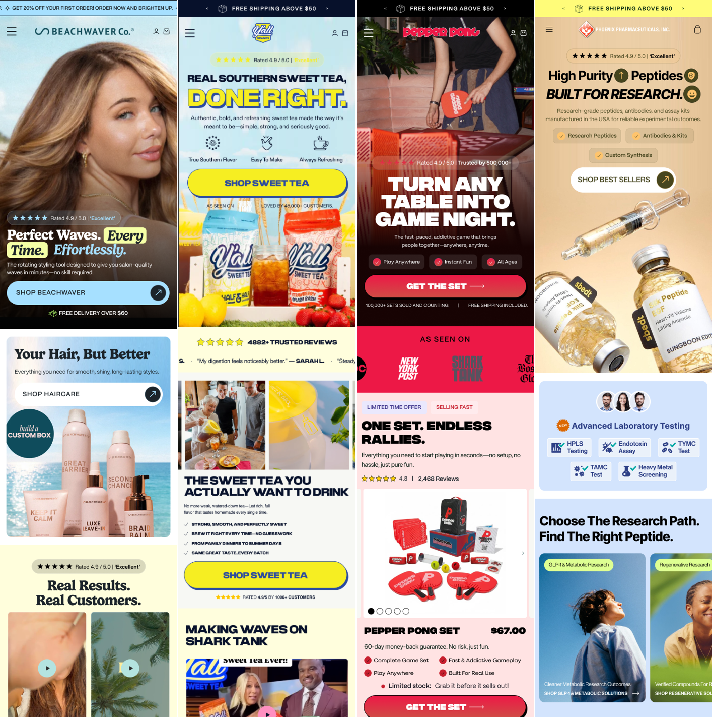
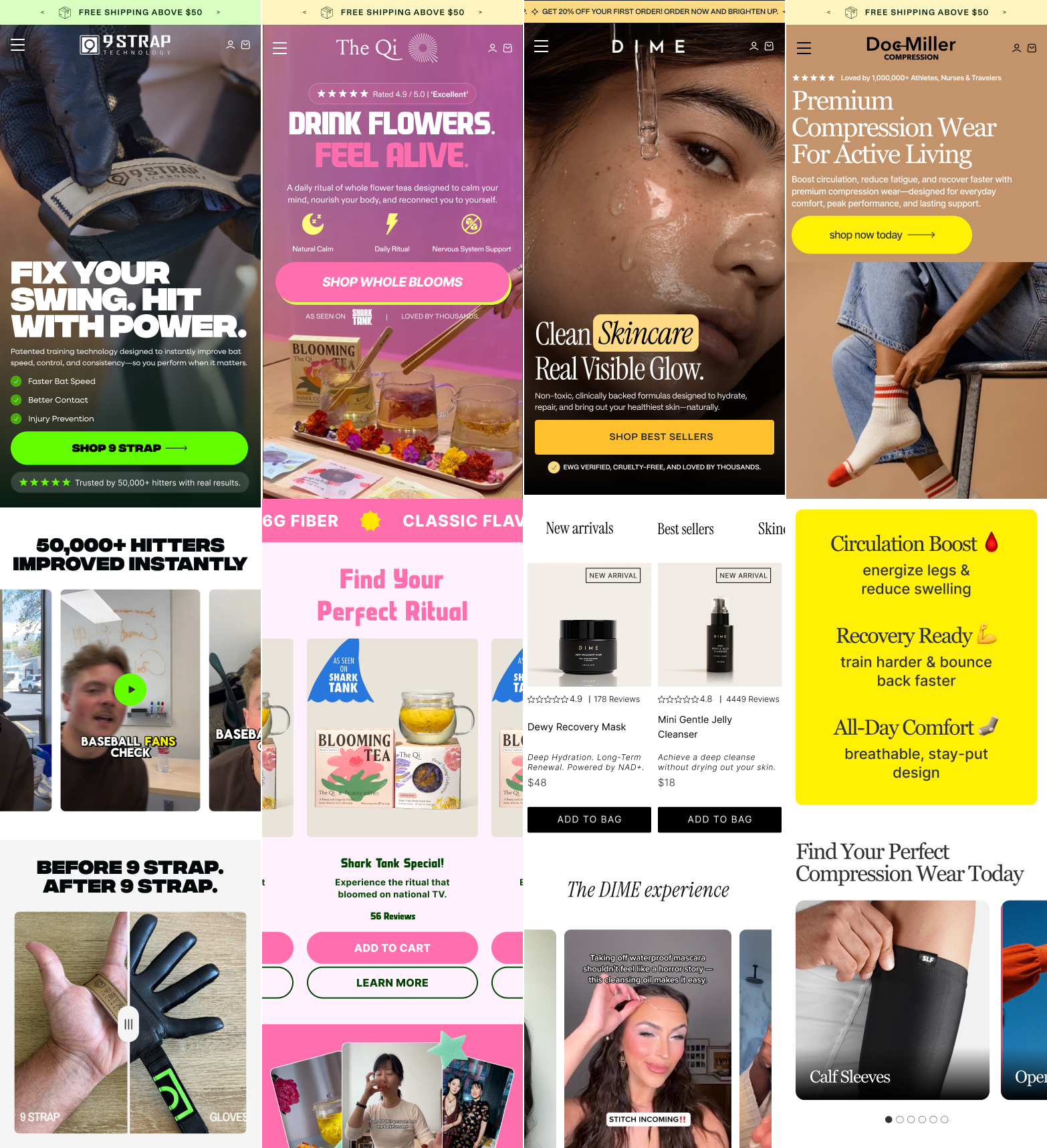
Every element below the fold is worthless until these six are locked in above it. Here are three brands doing it right.

Clear value prop + strong offer stacked together. The headline introduces the product, while the Spring Sale and free gift incentive create urgency. Two CTAs split by product line give the visitor a clear next step. Social proof (100M+ coffees made) and a 30-day guarantee sit right below the CTA, reducing risk before the click.

Benefit-driven headline with product shown in real context. "Unbleached, 100% cotton wipes for sensitive skin" is specific, outcome-first, and names the exact customer. The hero image shows the product in a natural lifestyle setting, not a studio cutout. Star rating anchors trust. The announcement bar reinforces differentiators (Made in USA, Unbleached, Dermatologist Tested) before the visitor even reaches the headline.

Bold, unmissable headline paired with immediate social proof. "NOKT Means Better Sleep" is direct and memorable, no filler. 10,594 five-star reviews sit above the headline, anchoring trust before the visitor reads a single word. The product image is large, clear, and dominant. The 30-day guarantee badge removes risk. One CTA. Zero confusion.
The 6-Element Audit
Open your page right now. Check each one. Every missing element is a bounce you didn't have to lose.
 ① Hero Image
② Headline
③ Sub-headline
④ CTA Button
⑤ Social Proof
⑥ Trust Bar
① Hero Image
② Headline
③ Sub-headline
④ CTA Button
⑤ Social Proof
⑥ Trust Bar
- Former Strategy Consultant at Deloitte (4 years)
- Built and scaled a 7-figure brand
- Scaled Solvexmedia from 2 employees to 20+ in 4 years
- Grew from 1 client to 400+ clients
"Out of 22 A/B tests, 14 were significant wins, generating $1,338,625 in incremental annual revenue without increasing ad spend."


| Metric | Before (Control) | After CRO + A/B Testing |
|---|---|---|
| Monthly Ad Spend | $30,000 | $30,000 |
| Monthly Sessions | 22,500 | 22,500 |
| Conversion Rate | 1.21% | 2.48% (+105%) |
| Average Order Value | $74 | $78 |
| Revenue Per Visitor | $0.90 | $1.93 |
| Cost Per Acquisition | $102 | $49 (52% lower) |
| Monthly Revenue | $20,250 | $43,425 |
| Annualized Impact | — | +$277,000 |
To Your Store?
We optimize stores from $1M to $50M+ per year. On the call we go through your store live, show you exactly where you're losing sales, and tell you what we would fix first. If we can't help, we tell you that too.
- 400+ brands optimized
- +105% CVR on the same ad spend
- $1.3M+ added for one client